Slider - Horizontal & Vertical
This document applies to both Slider - Horizontal & Slider - Vertical components
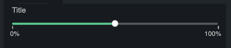
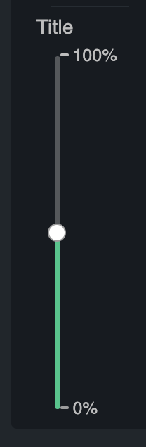
Properties
Title
Title to display above the slider. Set to an empty string to have no title.
Min
Number. Set's the numeric minimum of the slider.
Max
Number. Set's the numeric maximum of the slider.
Value
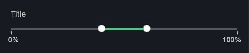
The selected value of the slider. For a slider with a single handle, this is a number. For a ranged sliders (i.e. a Slider with 2 handles), this should be an array of two numbers, such as [10, 40].
Note: if you do not link this value to the store, then the selected value will be fixed to the static value (i.e. you will not be able to drag the handle on the slider).
Example of a ranged slider:
Step
Number. The granularity with which the slider can step through values. Defaults to 1. When set to 0, the thumb can only be slid onto marks provided with the marks prop.
Enable Tooltip
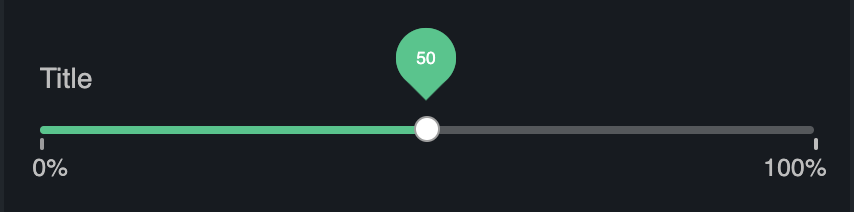
Sets the behavior of the tooltip. Options:
Disabled: Never show a tooltipShow on hover: Show a tooltip only when the user hovers over the handleAlways show: Always show a tooltip
Enable Tooltip Marks
When enabled makes tooltips use label instead of value
Labels
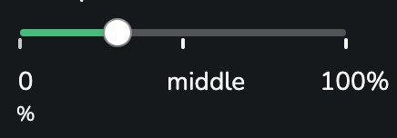
Configuration of the marks & labels to display on the Slider. Array of objects of the form: { value: number, label: string, labelSubText: string }. Each entry in the array will result in a tick on the Slider. Value refers to the slider value, label is the text below each tick mark and labelSubText will be rendered right below the label.
For example:
[
  { "value": 0, "label": "0", "labelSubText": "%" },
  { "value": 50, "label": "middle" },
  { "value": 100, "label": "100%" }
]
Display Every X Mark
Limits number of displayed marks. If there are 10 marks, from 1 to 10 and Display Every X Mark is set to 2 - slider will show only 2, 4, 6, 8 and 10 marks.
This feature is useful when more granularity is required while maintaining ui tidiness.
Dynamic Mark Count
Limits number of displayed marks to make sure they don't overlap. It uses Min. Mark Space to calculate number of fitting marks within available width. This functionality is applied after Display Every X Mark therefore it's possible to maintain informative design without visual overlap.
Min. Mark Space
Defines minimum space each mark will need to fit without overlap. Property used by Dynamic Mark Count.
Use As Day Slider
Automatically generates Min, Max and Labels to represent every minute of the day on slider
Show Current Value
Renders label of current value next to the slider
Display Control Buttons
Renders control buttons next to the slider. Buttons allow manual stepping between values.
